ageas.Plot()
This notebook demonstrate how to use ageas.Plot() to visualize GRNs or regulons reconstructed with key GRPs extracted with AGEAS.
[ ]:
import ageas
If visualization will be done in script after ageas.Launch() or ageas.Unit(), initialization Plot() object could be as simple as:
[ ]:
# ageas.Test() is a Launch() object using internalized data
# This would take a few minutes to run
test_launch_object = ageas.Test(cpu_mode = True)

# Here we use first network in atlas, network_0 for example
network = test_launch_object.atlas.nets[0]
Otherwise, we can load in networks from full_atlas.js or key_atalas.js output by ageas.Launch().
[ ]:
import ageas.tool.grn as grn
import ageas.tool.json as json

# Loading in networks from atlas file
# Here we use first network in atlas, network_0 for example
network = grn.GRN()
network.load_dict(
    json.decode(path = 'full_atlas.js')['network_0']
)
Then, a plotter object can be initialized as:
[ ]:
plotter = ageas.Plot(network = network,)
And graph of query network can be plotted and saved:
[ ]:
plotter.draw(
    legend_pos = (1.05, 0.3), # adjust legend position
    edge_width_scale = 1.0,   # adjust edge(GRP) width
)
plotter.save(path = 'test_plot.png', format = 'png')
Now, we should be able to get a network graph looks like: 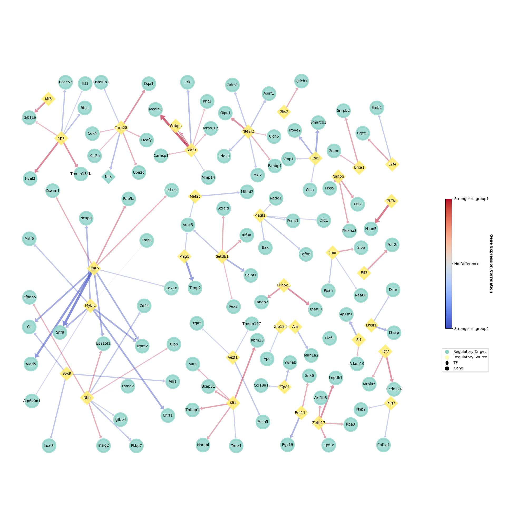
Also, we can visualize GRPs by correlation strength calculated with class 1 samples or class 2 samples.
[ ]:
plotter = ageas.Plot(
    network = network,
    plot_class = 'class2',  # using mef data here. 'class1' will be ipsc data
    hide_bridge = False,    # unhide GRPs linking regulatory sources
)
plotter.draw(
    legend_pos = (1.15, 0.3), # adjust legend position
    edge_width_scale = 1.0,   # adjust edge(GRP) width
)
plotter.save(path = 'test_plot.png', format = 'png')
Output should looks like: 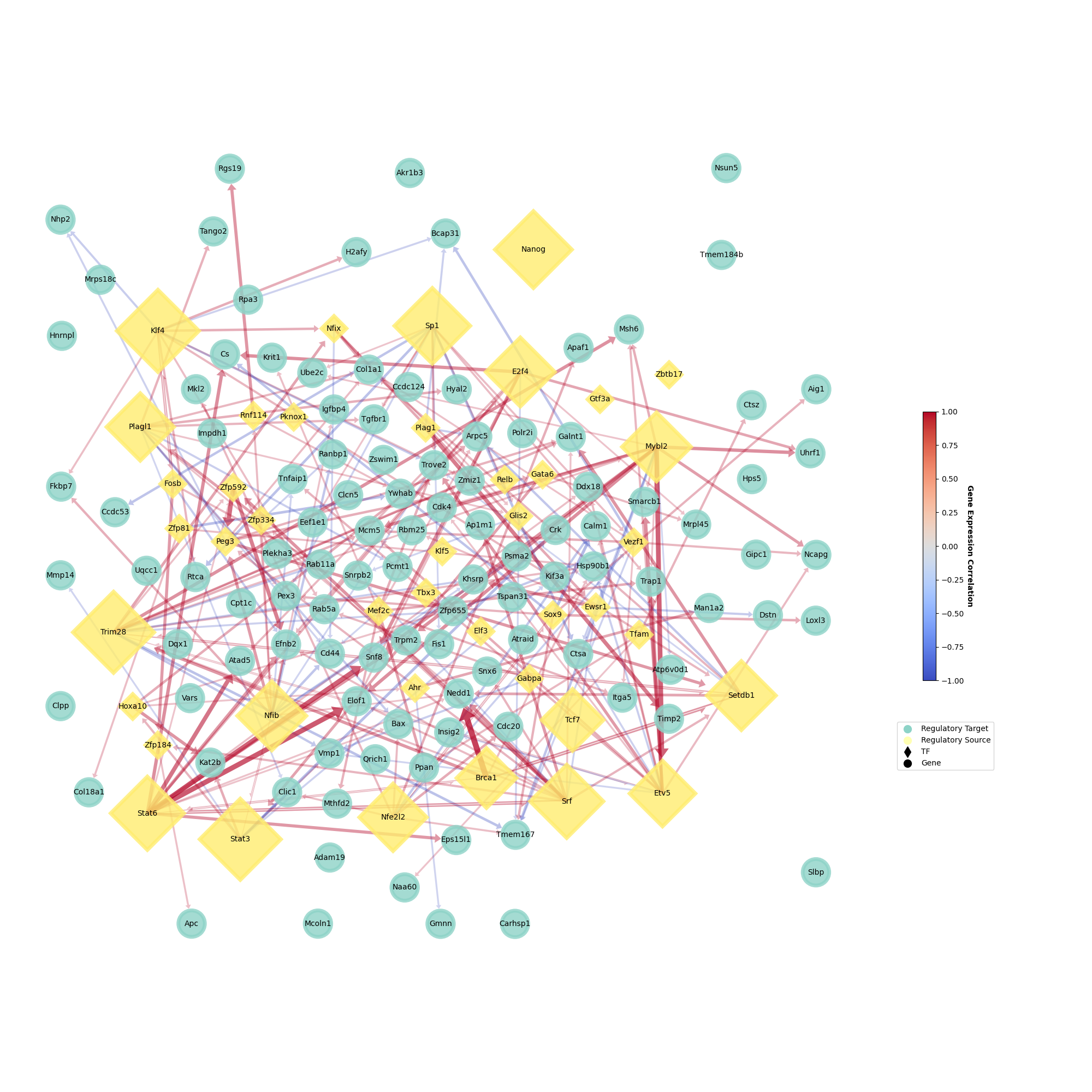
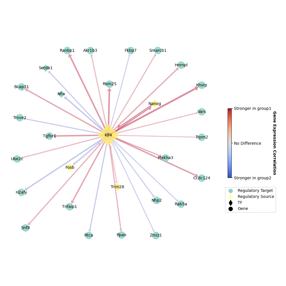
Surely, we can only visualize GRPs related to one specific gene of interest in order to avoid over-crowded graph.
[ ]:
plotter = ageas.Plot(
    network = network,
    hide_bridge = False,    # unhide GRPs linking regulatory sources
    root_gene = 'Klf4',     # Klf4 is our gene of interest
    depth = 1,              # and we are visualizing all GRPs directly linked with Klf4
)
plotter.draw(
    figure_size = 10,           # less GRPs here, smaller size would be better
    legend_pos = (1.3, 0.3),   # adjust legend position
    edge_width_scale = 2.0,     # adjust edge(GRP) width
)
plotter.save(path = 'test_plot_1.png', format = 'png')
And we shoud get something looks like: